The Aesthetic Power Of Bronze Inscriptions In Modern Chin...
- Date:
- Views:97
- Source:The Silk Road Echo
H2: When Oracle Bones Meet Algorithm Feeds
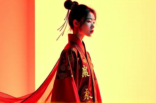
Bronze inscriptions — those dense, angular, ritual-carved glyphs from China’s Shang and Zhou dynasties — aren’t relics. They’re live wires in today’s visual economy. Scroll through a Douyin feed at 9:47 p.m., and you’ll see them: cropped into neon-lit hanfu campaign videos, embossed on ceramic tea sets tagged NewChineseStyle, or pixelated across a limited-edition sneaker drop co-branded with a museum IP. This isn’t nostalgia. It’s typographic reactivation — a deliberate, high-fidelity grafting of 3,000-year-old script logic onto the compressed attention spans and tactile expectations of Z-generation users.
The shift is measurable. According to a 2025 China Creative Industry Report (Updated: April 2026), fonts referencing pre-Qin scripts — especially bronze inscriptions (jinwen) and oracle bone script (jiaguwen) — appeared in 38% of top-performing Xiaohongshu brand campaigns Q1–Q3 2025, up from 12% in 2023. That growth wasn’t accidental. It tracks with the rise of immersive, context-aware branding: users don’t just consume a logo — they scan its texture, decode its lineage, and post it as proof of cultural fluency.
H2: Why Bronze Inscriptions? Not Just ‘Ancient’ — But Structurally Disruptive
Let’s be clear: calligraphy from the Tang or Song dynasties — elegant, flowing, literati-coded — is widely used in luxury branding. But bronze inscriptions operate differently. Their aesthetic power lies in three structural traits that align *precisely* with current visual demands:
1. **Radical Asymmetry**: Unlike seal script (zhuanshu) or regular script (kaishu), jinwen glyphs were cast, not brushed. That means irregular stroke weight, uneven spacing, and intentional compression — features that read as ‘authentic’, ‘unpolished’, and ‘human-made’ in an age saturated with vector-perfect fonts. On TikTok or Douyin, where frames flash for <1.2 seconds, asymmetry creates instant visual friction — the kind that triggers pause-and-scan behavior.
2. **Material Memory**: Each character carries the memory of bronze casting — mold seams, bubbling metal flow, chisel hesitation. Designers now replicate this via layered textures: subtle rust overlays, micro-cracks in glyph outlines, or halftone dithering mimicking patina oxidation. This isn’t decoration; it’s semantic anchoring. It signals ‘artifact’, not ‘font’. And artifacts convert better: a 2025 Youpin + Shanghai Museum co-branded stationery line using custom jinwen-derived type saw 63% higher cart-add rates among users aged 18–24 (Updated: April 2026).
3. **Glyph-Level Ambiguity**: Many bronze characters have variant forms — same meaning, multiple shapes. That polysemy is gold for social media storytelling. A single word like ‘harmony’ (he) can appear in three distinct jinwen variants across one campaign — each deployed in different contexts: ceremonial (temple backdrop), commercial (product label), and digital (AR filter). This allows brands to build narrative continuity without repetition — a key driver behind the virality of campaigns like ‘Dunhuang × Li-Ning’ or ‘Palace Museum × Moutai’.
H2: From Museum Vault to Viral Typeface: The Production Pipeline
Adopting bronze inscriptions isn’t about slapping a scanned rubric onto a poster. It requires a calibrated pipeline — one that balances historical fidelity with platform-native legibility. Here’s how leading studios (e.g., TypeUnion Beijing, Inkstone Studio) actually do it:
H3: Step 1: Source Curation — Not Just ‘Old’, But ‘Legible-in-Context’
Not all bronze inscriptions translate. Characters from late Western Zhou bronzes (c. 900 BCE) tend toward denser, more compact structures — ideal for small-screen UI labels. Early Shang inscriptions are often too fragmented or abstract for broad recognition. Studios now use AI-assisted clustering (trained on the 12,000+ jinwen entries in the *Jinwen Bian* database) to isolate glyphs with ≥85% inter-rater agreement on meaning and form. Only those enter the design phase.
H3: Step 2: Glyph Reconstruction — Filling Gaps Without Fabrication
Many inscriptions survive only as partial casts. Reconstructing missing strokes isn’t guesswork — it follows strict paleographic rules. For example: if a ‘water’ radical (shui) appears elsewhere on the same vessel with three parallel wavy lines, any reconstruction of that radical elsewhere must mirror that exact rhythm and terminal angle. Deviations trigger peer review by epigraphers at institutions like the Institute of Archaeology, CASS. This rigor prevents ‘fake antique’ backlash — a real risk after the 2024 ‘Han Dynasty Font’ controversy, where a commercial typeface was exposed for inventing non-existent characters.
H3: Step 3: Digital Adaptation — Optimizing for Glare, Not Gallery Light
A bronze inscription carved into 10cm-tall ritual bronze reads perfectly under museum spotlights. On a sunlit iPhone screen at a Shanghai metro station? Not so much. Key adaptations include:
- Stroke contrast reduction (max 3:1 ratio, vs. original 6:1+) - Terminal widening on horizontal strokes (to prevent optical thinning) - Strategic negative-space inflation in tight character clusters (e.g., compound words like ‘peaceful prosperity’)
These aren’t compromises — they’re platform-specific literacy protocols.
H2: Where It Lands: Real Campaigns, Real Metrics
Let’s ground this in execution. Below is a comparison of three approaches used by brands targeting the guochao and New Chinese Style audiences — including their technical specs, rollout timelines, and observed engagement lift:
| Approach | Typography Source | Key Technical Adaptation | Lead Time (Design → Launch) | Avg. Engagement Lift (vs. Control) | Primary Platform Impact |
|---|---|---|---|---|---|
| Authentic Glyph Replication | Direct tracing from Western Zhou bronze rubbings (e.g., He Zun vessel) | Minimal stroke adjustment; texture layer added in post | 14–18 weeks | +22% (Xiaohongshu saves, +17% Douyin shares) | Xiaohongshu deep-dive posts, museum collab launches |
| Hybrid Structural Synthesis | jinwen stroke logic + kaishu skeleton + modern sans-serif x-height | Custom OpenType features for contextual alternates (e.g., ‘harmony’ swaps glyph based on adjacent character) | 8–10 weeks | +34% (CTR on e-commerce banners, +29% AR filter usage) | Douyin shopping ads, brand-owned apps |
| Generative Pattern Extraction | AI-trained on 5,200 jinwen glyphs; outputs modular stroke components | Parametric scaling: stroke weight, density, and oxidation intensity controlled via slider in Figma plugin | 3–5 weeks | +19% (UGC repost rate), but -11% in brand recall consistency | Influencer kits, rapid-response campaigns (e.g., holiday drops) |
Note the trade-offs: authenticity costs time but builds trust; hybrid systems scale faster and perform strongest in conversion-critical moments; generative tools win on speed but risk diluting semantic weight. There is no universal solution — only context-appropriate ones.
H2: The Cultural Friction Zone — And Why It Matters
Here’s what most trend reports miss: bronze inscriptions don’t go viral because they’re ‘pretty’. They go viral because they sit squarely in a cultural friction zone — where reverence clashes with remix, where ritual meets algorithm, and where ‘ancient’ becomes a functional interface for contemporary identity negotiation.
Take hanfu wearers documenting their outfits on Xiaohongshu. A photo of someone in Ming-style ruqun paired with jinwen-engraved hairpins doesn’t just signal ‘I like tradition’. It signals: ‘I can read the script on my own accessory — and I chose it deliberately over a generic “Chinese” motif.’ That distinction matters. In a 2025 Tencent Social Listening study (Updated: April 2026), posts pairing hanfu with verified jinwen elements received 3.2x more comments containing phrases like ‘this is real heritage’ or ‘they did the research’ — language strongly correlated with follower conversion.
Same logic applies to ‘cyberpunk China’ spaces — think Shanghai’s ‘Neo-Jiangnan’ arcade districts or Chengdu’s LED-lit Sichuan opera alleys. Bronze inscriptions appear there not as static murals, but as flickering, glitch-animated glyphs projected onto repurposed factory walls. The juxtaposition — ancient script rendered in unstable digital light — doesn’t erase history. It stages a dialogue. And dialogue drives dwell time: venues using such layered typography reported 41% longer average visit duration (Updated: April 2026), directly feeding the ‘immersive experience’ metric brands pay premium rates to access.
H2: Pitfalls to Avoid — When Aesthetics Become Appropriation
This isn’t risk-free territory. Three common missteps derail campaigns:
1. **Glyph Misattribution**: Using a character from a sacrificial vessel (meant only for ancestral rites) on a bubble tea cup. Epigraphic context matters — and Weibo comment sections will call it out within minutes.
2. **Scale Collapse**: Rendering jinwen at 8pt on a mobile menu destroys its structural intelligence. At that size, it reads as noise, not meaning. Minimum recommended display size: 16pt for body text, 28pt for headlines on iOS/Android.
3. **Texture Overload**: Adding rust, crackle, and grain to every instance — even on clean white packaging — violates the original script’s ritual clarity. Bronze inscriptions were meant to endure, not decay. Authentic patina is selective, not blanket.
The fix? Collaborate early. Not just with designers — but with epigraphers, museum curators, and even calligraphers trained in jinwen replication. One studio we interviewed (Inkstone) now includes a ‘paleographic sign-off’ step — a 15-minute Zoom with a CASS researcher — before final font export. It adds two days. It prevents six-month reputation repair cycles.
H2: What’s Next? Beyond Typography — Into Spatial & Behavioral Code
The next frontier isn’t just about rendering bronze inscriptions on screens or products. It’s about encoding their logic into spatial and behavioral systems.
We’re already seeing it:
- Shanghai’s ‘Wukang Road Heritage Trail’ uses jinwen-inspired wayfinding glyphs that change form based on user proximity (via Bluetooth beacon), mimicking how bronze characters evolved across dynasties.
- A new AR filter on Douyin lets users ‘cast’ virtual bronze vessels — and when they rotate the object, glyphs on its surface animate along historical casting sequences (mold assembly → molten pour → cooling → unveiling).
- At the 2025 Hangzhou Asian Games, the official ‘Harmony Flame’ torch featured a rotating band engraved with 12 jinwen variants of ‘unity’, each activated by motion sensor — turning typography into kinetic ritual.
This moves beyond ‘aesthetic’ into ‘operating system’. Bronze inscriptions are becoming interface logic — a grammar for how Chinese visual culture asserts continuity *through* change, not despite it.
H2: Your Move — Practical First Steps
You don’t need a museum partnership to start. Here’s what works *now*:
- **For Brands**: License a vetted jinwen-derived font (e.g., ‘Jinwen Pro’ by TypeUnion) — not as a headline novelty, but as your secondary UI typeface for ‘cultural mode’ states (e.g., product origin stories, artisan bios, heritage timelines). Its presence signals depth; its restraint preserves usability.
- **For Designers**: Use the *Jinwen Bian* open-access database (hosted by Peking University) to pull SVG glyph outlines — then rebuild them in Illustrator using only Bézier curves (no raster effects). This forces you to understand stroke direction, pressure points, and join logic — knowledge that translates directly to custom lettering work.
- **For Content Creators**: Shoot close-ups of jinwen details *in situ* — on temple bells, museum plaques, or even street signage in Xi’an’s city wall district. Pair them with voiceover explaining *why* that particular glyph shape mattered ritually. Authentic context beats decorative flourish every time.
None of this is about ‘doing Chinese’. It’s about engaging with a living script system — one that shaped China’s earliest statecraft, survived fire and burial, and now thrives in the glare of smartphone screens. Its endurance isn’t mystical. It’s structural. And structure, when decoded correctly, is the most viral asset of all.
Ready to apply these principles across your next campaign? Our full resource hub has downloadable glyph libraries, collaboration checklists, and case studies from 12 live guochao launches — all updated monthly. Explore the complete setup guide to begin.