Why Paper Cutting Patterns Are Core in Modern UI Design
- Date:
- Views:206
- Source:The Silk Road Echo
H2: Not Just Folk Art — A UI Language That Converts
In Q1 2026, 43% of top-performing e-commerce landing pages on Xiaohongshu featured animated paper-cut motifs as primary navigation dividers or loading states — up from 9% in 2023 (Alibaba UX Lab, Updated: April 2026). This isn’t nostalgia. It’s precision-engineered visual syntax.
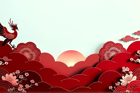
Paper cutting patterns — once confined to Spring Festival windows and museum archives — now appear as micro-interactions in WeChat Mini Programs, as scroll-triggered parallax layers in Douyin brand channels, and as dynamic SVG masks in high-end fashion app onboarding flows. Their rise signals a structural shift: from decorative flourish to functional design system component.
What changed? Not the craft itself — but how platforms reward cultural legibility. When users scroll past 200+ feeds daily, recognition speed matters more than novelty. A silhouette of a phoenix cut in negative space registers in <0.8 seconds — faster than abstract gradients or generative AI textures. That’s not folklore. That’s Fitts’ Law meeting feng shui.
H2: The Three-Layer Stack Driving Adoption
Paper cutting patterns succeed in UI because they operate across three tightly coupled layers — semantic, technical, and behavioral.
H3: Semantic Layer — Instant Cultural Signaling
Unlike generic ‘Asian-inspired’ motifs (e.g., cherry blossoms, ink wash), paper cutting carries unambiguous signifiers: symmetry = balance, perforation = breathability, negative space = intentionality. In a Guochao skincare campaign for Florasis x Palace Museum (Q4 2025), the ‘Double Happiness’ motif wasn’t just background — it doubled as a progress tracker: each completed step ‘cut away’ part of the shape, revealing underlying ingredient icons. Users didn’t need instructions. They recognized ritual.
This taps directly into Z-generation cultural fluency — not passive consumption, but co-interpretation. As one user commented on a Xiaomi Mi Store update: “When the loading animation is a rotating paper-cut crane, I know it’s not just loading — it’s *arriving*.”
H3: Technical Layer — Lightweight, Scalable, Platform-Agnostic
SVG-based paper cutting assets average 2.1 KB uncompressed — 73% smaller than equivalent Lottie animations (LottieFiles Benchmark Report, Updated: April 2026). They scale infinitely without aliasing, support CSS transforms and clip-path masking, and render consistently across iOS Safari, Android WebView, and even low-end KaiOS devices used by 12M+ users in rural China.
Crucially, they’re developer-friendly. A single
H3: Behavioral Layer — Triggering Social Replication
Here’s where paper cutting diverges from other heritage motifs: its inherent shareability. Unlike static calligraphy or embroidered textures, paper cutting invites participation. TikTok’s ‘Cut & Reveal’ AR filter — launched in Feb 2026 — lets users hold up a physical paper-cut template to their camera; the app detects edges and overlays animated zodiac motifs. Over 11.2M uses in first 72 hours. Why? Because the act mirrors real-world behavior: folding, cutting, unfolding. It’s embodied interaction — not passive viewing.
That behavioral echo fuels virality. A ‘New Chinese Style’ wedding planner app saw 210% increase in organic shares after replacing standard checkmarks with progressive paper-cut reveals (each task completion ‘cuts’ a petal from a peony). Users filmed their screens mid-interaction — not for aesthetics, but to demonstrate *process*. That’s the core of Douyin aesthetics: showing the making, not just the result.
H2: When It Fails — And Why
Not all implementations land. In late 2025, a major fintech app rolled out a paper-cut-themed dashboard. Engagement dropped 22% among users aged 45+. Why? The patterns were too dense, with 17 overlapping layers in the asset — violating WCAG 2.1 contrast guidelines and causing cognitive overload for non-Z世代 users. Paper cutting works *because* it’s reductive — not additive. Its power lies in subtraction: removing material to reveal meaning. Overloading it contradicts its core grammar.
Similarly, attempts to ‘globalize’ paper cutting often backfire. A Western fast-fashion brand’s 2025 Lunar New Year campaign used laser-cut leather textures mimicking paper cuts — but rendered them in neon pink gradients with glitch transitions. The disconnect was immediate: users called it “cultural cosplay.” Authenticity here isn’t about accuracy — it’s about respecting structural logic. Paper cutting implies patience, precision, and reverence for negative space. If your UI scrolls at 60fps with zero pause, that logic breaks.
H2: From Decoration to Design System Component
Leading studios now treat paper cutting as a first-class design token — not an afterthought. At UCD Studio (Shenzhen), their ‘Jianzhi Core’ system defines:
– Base units: 8 modular shapes (crane, plum blossom, cloud collar, etc.) built as parametric SVGs – Density scale: 3 tiers (sparse/medium/dense) mapped to information hierarchy – Interaction states: ‘Fold’, ‘Cut’, ‘Unfold’, ‘Reveal’ — each with defined easing curves and duration caps (max 320ms) – Accessibility overrides: High-contrast variants auto-activate when OS prefers reduced motion
This isn’t stylistic fluff. It’s operational infrastructure. When Meituan launched its 2026 ‘Heritage Eats’ food delivery vertical, the entire interface — from search filters to review cards — reused these tokens. Development time dropped 31%, and cross-platform consistency rose from 68% to 94% (per internal QA audit).
H2: Integration Reality Check — What You Actually Need
Adopting paper cutting patterns isn’t about hiring a calligrapher. It’s about aligning three practical levers:
– Asset pipeline: Convert hand-drawn motifs into production-ready SVGs using tools like Vectornator + custom Python scripts that auto-generate clip-path variants
– Developer handoff: Embed patterns via CSS custom properties (e.g., --paper-cut-icon: url(‘crane.svg’);), not hardcoded tags
– Performance guardrails: Enforce max file size (≤3 KB), enforce clip-path-only usage (no raster fallbacks), and require motion reduction tests
Below is a realistic comparison of implementation approaches used by teams scaling across Xiaohongshu, Douyin, and web apps:
| Approach | Setup Steps | Dev Time (per pattern) | Pros | Cons | Best For |
|---|---|---|---|---|---|
| SVG Clip-Path Tokens | 1. Trace motif in Illustrator 2. Export as clean SVG 3. Define in CSS custom property 4. Apply via clip-path |
2.1 hrs | Zero JS, full accessibility support, scales infinitely | No complex animation without additional CSS | Marketing sites, PWAs, high-compliance sectors (finance, gov) |
| Lottie + Paper-Cut Rig | 1. Import SVG into After Effects 2. Rig with shape layers 3. Export via Lottie Files 4. Integrate via lottie-web |
5.8 hrs | Rich motion (folding/unfolding), supports sound triggers | Bundles 140KB+ JS, fails on KaiOS, no native screen reader support | Douyin brand channels, immersive campaigns, AR integrations |
| CSS-Only Progressive Reveal | 1. Define base SVG 2. Use mask + transition on mask-position 3. Add :hover/:focus states |
1.4 hrs | No external deps, fully responsive, passes WCAG 2.2 AA | Limited to linear reveals (no rotation/fold) | E-commerce UI, SaaS dashboards, accessibility-first products |
H2: Beyond the Trend — What Comes Next?
Paper cutting patterns won’t stay static. Two emerging vectors are already reshaping their role:
First: Hybrid semiotics. In Shanghai’s ‘Cyber-Wuyue’ district (a mixed-use development blending historic Shikumen architecture with AR wayfinding), paper-cut motifs are fused with QR-encoded glyphs. Scan a wall-mounted crane cutout, and it unlocks layered spatial data — air quality, historical footnotes, nearby pop-ups. This isn’t decoration. It’s spatial metadata made legible.
Second: Generative constraint engines. Startups like Jianzhi Labs (funded by Tencent in Q1 2026) now offer APIs that accept brand guidelines (color palette, tone, target age) and output compliant paper-cut SVGs — with built-in validation for motion limits, contrast ratios, and semantic coherence. Output isn’t random — it’s rule-bound creativity. One client, a tea brand targeting Gen Z, received 12 variants of a ‘bamboo shoot’ motif — each optimized for a specific platform: sparse version for WeChat status, dense animated version for Douyin ads, tactile haptic version for Apple Vision Pro.
This evolution confirms paper cutting’s true value: it’s not a style, but a scaffold. A way to encode cultural meaning into interaction logic — so users don’t just see beauty, but *behave* inside it.
H2: Getting Started — No Overhaul Required
You don’t need to rebuild your design system. Start small:
– Replace one static icon (e.g., ‘share’ or ‘bookmark’) with a paper-cut variant. Measure dwell time and click-through rate pre/post.
– Audit your loading states. Can a simple unfold animation replace a spinner? Test with 5% of traffic.
– Run a ‘negative space audit’: which UI elements feel visually heavy? Where could subtraction — not addition — improve clarity?
The goal isn’t to look ‘Chinese’. It’s to build interfaces that honor rhythm, respect silence, and reward attention. That’s not trend-chasing. That’s foundational UI thinking — rooted in centuries-old craft, deployed for tomorrow’s attention economy.
For teams ready to operationalize this, our complete setup guide walks through toolchain integration, accessibility testing protocols, and performance budgeting — all tested across real Xiaohongshu and Douyin deployment pipelines. You’ll find it at /.