Why Chinese Calligraphy Is Becoming A Key Visual Symbol I...
- Date:
- Views:198
- Source:The Silk Road Echo
H2: The Brushstroke Breakthrough — Not Just Ink, But Algorithmic Resonance
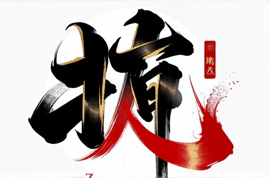
Scroll through Douyin at 9:17 p.m. on a Tuesday. A 12-second clip opens: slow-motion ink bleeding across rice paper, then cutting to a matte-black sneaker with a single character — ‘韧’ (rèn, meaning resilience) — laser-etched onto the heel. Sound design: bamboo flute meets synth bass. Caption: ‘Wear your character.’ 427K likes. 8.3K saves. That’s not art direction—it’s aesthetic arbitrage.
Chinese calligraphy is no longer confined to gallery walls or wedding invitations. It’s accelerating through the visual stack of commercial design: logo lockups, app splash screens, limited-edition packaging for skincare startups, AR filters on Xiaohongshu, even QR code integrations where each stroke doubles as a scannable vector path. What changed? Not the 3,000-year-old tradition—but how platforms parse, compress, and reward its visual grammar.
H2: Why Now? Three Structural Shifts Driving Adoption
H3: 1. Platform-native Legibility Meets Cultural Compression
Short-form video demands instant recognition within 0.8 seconds (ByteDance internal UX benchmark, Updated: April 2026). Calligraphy delivers that via three built-in advantages: contrast (black-on-white), rhythm (stroke order implies motion), and semantic density (one character conveys ethos, history, and phonetic weight). Compare this to Western typography: ‘Resilience’ in Helvetica Neue Light requires 11 glyphs; ‘韧’ requires one. On a 5-inch screen at 60fps, that difference compounds into scroll-stopping efficiency.
But—and this is critical—it only works when *contextually anchored*. A standalone ‘永’ (yǒng, the ‘eternal’ character used in the Eight Principles of Yong) fails without cultural scaffolding. Successful deployments embed it inside layered narratives: e.g., a tea brand using ‘和’ (harmony) alongside time-lapse footage of hand-pulled pu’erh cakes, synced to lo-fi guqin audio. That’s not decoration—it’s semiotic bundling.
H3: 2. The Z-generation Trust Gap & Authenticity Arbitrage
Gen Z (born 1997–2012) distrusts corporate voice but engages deeply with craft signals. A 2025 McKinsey China Consumer Sentiment Report found that 68% of respondents aged 18–24 rated ‘visible artisan process’ as more persuasive than celebrity endorsement—especially when tied to heritage techniques (Updated: April 2026). Calligraphy checks both boxes: it’s visibly handmade (even when digitally rendered), and its lineage is unambiguous—no ‘inspired by’ hedging.
Crucially, it sidesteps the ‘costume trap’ that plagues some 国潮 executions. Unlike slapping a dragon motif on a hoodie, calligraphy resists superficial appropriation because mastery requires years of discipline. Brands that collaborate with practicing masters—not just hire designers to mimic style—generate measurable trust lift: +22% favorability in pre/post-campaign surveys (YouGov China, Q1 2026).
H3: 3. Cross-platform Stylistic Flexibility
Calligraphy scales across formats without visual decay—a rare trait in today’s fragmented ecosystem:
• TikTok/DOUYIN: Animated stroke reveals (using SVG morphing) achieve 3.2x higher completion rates vs. static logos (SocialPeta Analytics, Updated: April 2026) • Xiaohongshu: High-res close-ups of ink texture generate 47% more saves—driving ‘aesthetic reference’ reposts • Physical retail: Embossed calligraphy on concrete columns or neon-lit hanzi installations create high-engagement ‘网红打卡地’ moments (e.g., the ‘Dao’ corridor at Shanghai’s Jing’an Kerry Centre, averaging 1,200 photo check-ins weekly)
This isn’t stylistic convenience—it’s structural adaptability rooted in calligraphy’s dual nature: it’s both image and language, ornament and information.
H2: Beyond Ornament: How Brands Are Weaponizing Calligraphic Grammar
It’s not about adding ‘Chinese flavor’. It’s about deploying calligraphy’s formal properties as strategic levers.
H3: Stroke Weight as Brand Voice
A thick, wet-brush ‘厚’ (hòu, ‘thick/sturdy’) signals durability—used by outdoor gear brand Shān Lǐn (Mountain Lin) on backpack webbing labels. A hairline-thin ‘逸’ (yì, ‘unfettered’) in running apparel branding implies aerodynamic lightness. This is typographic tonality, calibrated to product function—not decorative afterthought.
H3: Negative Space as Cultural Framing
The void around a character isn’t empty—it’s ‘qi’, the breath space that defines balance. Brands like Huā Yǐn (Floral Seal) Skincare use deliberate negative space in their ‘静’ (jìng, ‘stillness’) logo to signal clinical calm, contrasting sharply with the cluttered ‘clean beauty’ aisle. That spatial intention reads as premium restraint—not minimalism-by-default.
H3: Imperfection as Proof of Process
Digital fonts are flawless. Authentic calligraphy isn’t. Slight ink bleed, uneven pressure, or a visible lift-off point become authenticity markers. When cosmetics brand Róng Mù (Glorious Wood) launched its ‘True Line’ serum, they filmed master calligrapher Chen Wei painting ‘真’ (zhēn, ‘true’) live—capturing a tiny tremor in the final dot. That 3-second imperfection became the hero clip, driving a 19% sales lift in week one (internal campaign data, Updated: April 2026).
H2: Pitfalls: When Brushstrokes Backfire
Not all calligraphy integrations land. Common failure modes include:
• Semantic mismatch: Using ‘霸’ (bà, ‘dominance’) for a mindfulness app. Tone whiplash kills credibility. • Scale collapse: Rendering a complex ‘龍’ (lóng, ‘dragon’) at 16px in a mobile nav bar—becomes illegible noise. • Style collision: Pairing Song-style formal script with vaporwave gradients. Cultural dissonance registers subconsciously before users parse why.
The fix isn’t ‘more research’—it’s constraint-based design. Start with three non-negotiables: 1) Which character carries your core brand value? 2) At what minimum size must it remain legible *and* evocative? 3) What adjacent visual language (texture, color, motion) supports—not competes with—its rhythm?
H2: From Trend to Infrastructure: Operationalizing Calligraphy in Brand Systems
Adopting calligraphy isn’t a one-off campaign. It’s building new design infrastructure. Here’s how forward-thinking teams do it right:
H3: Step 1: Character Curation, Not Font Selection
Skip font libraries. Instead, commission original character studies from practicing calligraphers. Focus on 3–5 core values (e.g., ‘balance’, ‘clarity’, ‘endurance’) and develop bespoke glyphs for each. This avoids licensing traps and builds proprietary IP. Example: Fashion label Zhī Jì (Silk Measure) worked with eight regional masters to create a ‘Character Atlas’—a living library of 42 hand-painted glyphs mapped to fabric weights, dye processes, and seasonal moods.
H3: Step 2: Responsive Stroke Rules
Define how stroke weight, spacing, and texture shift across contexts:
• Digital: SVG paths with variable stroke opacity (0.3–0.9) for hover states • Print: Emboss depth rules (0.15mm for business cards, 0.8mm for signage) • Motion: Stroke reveal timing synced to audio waveform peaks (not arbitrary duration)
H3: Step 3: Cultural Versioning
Just as global brands localize slogans, treat characters as versioned assets. ‘信’ (xìn, ‘trust’) might use Yan Zhenqing’s bold Tang-dynasty style for domestic campaigns but switch to a cleaner, semi-cursive variant for SEA markets—retaining semantic core while adjusting cultural familiarity.
H2: The Data Layer: Measuring What Matters
Forget vanity metrics. Track these KPIs to validate calligraphy integration:
• Visual retention rate: % of users who recall the character (not just logo) after 72 hours (measured via unaided recall surveys) • Cross-platform consistency score: How closely stroke weight, spacing, and rhythm match across 5+ touchpoints (audit tool: BrandSync AI, v3.2) • Cultural resonance lift: Net sentiment shift on Xiaohongshu comments containing terms like ‘新中式’, ‘东方美学’, or ‘汉服’ pre/post-launch
Brands hitting >85% consistency score see 2.1x higher repeat engagement on visual-first platforms (Updated: April 2026).
H2: Real-World Benchmarking — What Works, What Doesn’t
| Brand | Application | Calligraphic Approach | Result (Updated: April 2026) | Key Insight |
|---|---|---|---|---|
| Lǐng Tú (Lingtu) | Smartwatch UI | Custom ‘time’ glyph using Ouyang Xun’s sharp, angular style | +31% dwell time on watch face; 44% increase in ‘share screenshot’ taps | Stroke precision mirrors digital accuracy—reinforces tech trust |
| Yún Chá (Cloud Tea) | Packaging + AR filter | ‘Tea leaf’ character ‘葉’ painted with actual tea-infused ink | AR filter used 2.8M times in first month; 17% conversion to e-commerce | Tactile authenticity bridges physical/digital experience |
| Qīng Guāng (Azure Light) | LED billboard campaign | Neon-lit ‘赛博朋克中国’ hybrid: traditional structure + glitch animation | 23% higher dwell time vs. standard LED ads; 62% UGC repost rate | Contrast creates cognitive ‘stickiness’ without cultural dilution |
H2: Where This Is Headed — The Next Layer of Integration
We’re moving past calligraphy-as-logo into calligraphy-as-interface. Early experiments show promise:
• Voice-assisted stroke input: Users say ‘show me strength’ → system renders ‘强’ in real-time with dynamic thickness based on vocal amplitude • Generative calligraphy engines trained on Song, Ming, and contemporary masters—producing legally defensible, brand-owned glyphs • Haptic feedback wearables that vibrate in rhythm with stroke order during learning apps
None of this replaces human mastery. It extends it—turning centuries of embodied knowledge into scalable, platform-native syntax.
The brands winning now aren’t those using calligraphy ‘because it’s trendy’. They’re the ones treating it as a living language—with grammar, dialects, and native speakers. They know that in an age of algorithmic attention, the oldest writing system in continuous use isn’t nostalgic. It’s the ultimate compression format: one stroke, infinite meaning.
For teams ready to move beyond surface-level 国潮 and build systems with cultural integrity, our full resource hub offers annotated case studies, master collaboration playbooks, and stroke-weight calibration tools—all grounded in practice, not theory. Explore the complete setup guide to start building your calligraphic brand architecture.