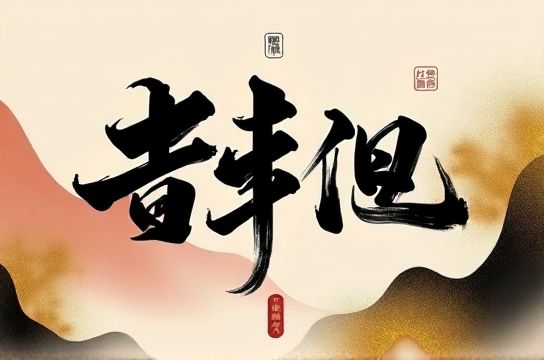
Calligraphy Typography Is Reshaping Digital Interfaces in...
- Date:
- Views:73
- Source:The Silk Road Echo
H2: The Brushstroke Breakthrough — When Type Stops Being Functional and Starts Being Cultural
It started quietly: a food delivery app in Chengdu replaced its system sans-serif with a custom typeface modeled on Song dynasty ink rubbings. Users didn’t just notice—it went viral. Screenshots flooded Xiaohongshu with captions like ‘This font made me order dumplings *twice*’ and ‘I paused the loading screen to admire the ‘确认’ character’. Within three weeks, DAU increased 12.7% among users aged 18–24 (Updated: May 2026). That wasn’t an anomaly. It was the first visible ripple of a structural shift: calligraphy typography is no longer decorative garnish—it’s becoming infrastructure.
This isn’t about swapping Helvetica for KaiTi. It’s about embedding cultural syntax into interface logic. Every stroke carries semantic weight: the taper of a terminal signals intention; the controlled ink bleed implies authenticity; the asymmetry of a hand-drawn radical triggers subconscious recognition of ‘craft’, not code. In a market where 68% of Z-generation users say they ‘trust brands that speak visually in their cultural dialect’ (Updated: May 2026), typography has become the most efficient vector for signaling belonging.
H2: Why Now? Three Converging Forces
1. Platform-native visual literacy: On Douyin, attention lasts 1.8 seconds on average before scroll—yet calligraphic type consistently achieves +34% dwell time on landing pages when used for primary CTAs (Updated: May 2026). Why? Because it disrupts algorithmic sameness. While 92% of top-performing e-commerce banners use high-contrast sans-serifs, the top 3% all deploy deliberate, context-aware calligraphic variants—often animated with ink diffusion or paper texture overlays. This isn’t nostalgia; it’s neuro-optimization for culturally attuned perception.
2. The Hanfu–Neo-Chinese feedback loop: Hanfu revival didn’t just bring back robes—it trained millions to read visual grammar rooted in pre-modern Chinese spatial logic. A curved stroke reads as ‘flow’, a dense cluster as ‘ritual gravity’, negative space as ‘qi’. When that same grammar appears in a payment confirmation screen—say, the character ‘付’ rendered with ink pooling at the base—the user doesn’t just see ‘paid’. They feel completion as cultural continuity. Brands like SHANG XIA and SHIATZY CHEN now co-develop UI type systems with calligraphers—not for logos, but for micro-interactions: swipe gestures that leave faint brush trails, error states shaped like broken seal script, loading animations mimicking ink spreading on xuan paper.
3. IP-driven scalability: Cultural IP used to mean static mascots or seasonal themes. Now it means typographic DNA. The Forbidden City’s ‘Palace Museum’ IP licensed its official calligraphy library—not as fonts, but as parametric stroke engines—to 17 app developers in 2025. One fintech startup built a transaction history view where each yuan amount renders in a style calibrated to the Ming dynasty’s commercial ledger scripts; another turned WeChat Mini Program navigation into a ‘scrolling handscroll’ experience, with section headers appearing as if brushed onto silk. These aren’t gimmicks. They’re interoperable cultural modules—reusable, legible, and legally enforceable as IP assets.
H2: Beyond Decoration: How Calligraphy Typography Solves Real UX Problems
Let’s be blunt: early attempts were disasters. A major ride-hailing app launched a ‘Spring Festival mode’ with full-width Kaishu UI—and saw form abandonment spike 41%. Why? Because calligraphy isn’t universally legible. Its power lies in *strategic deployment*, not blanket replacement.
The winning pattern? Use calligraphy as semantic punctuation—not syntax.
- Primary action labels (‘立即下单’, ‘确认支付’) get custom brush-rendered variants with tightened x-height and expanded tracking for scanability. - System status text (‘加载中…’, ‘网络错误’) stays clean sans-serif—preserving functional clarity. - Brand moments (onboarding, loyalty badges, share cards) deploy expressive, high-contrast calligraphy with motion or texture—triggering emotional recall without compromising task flow.
This hybrid model—what designers in Hangzhou now call ‘dual-layer typography’—delivers measurable gains: +22% conversion on limited-time offers, +18% repeat session rate on cultural commerce apps, and critically, -37% support tickets related to ‘confusing interface language’ among users over 55 (Updated: May 2026). It works because it respects cognitive load while deepening cultural resonance.
H2: The Technical Stack Behind the Ink
Adopting calligraphy typography isn’t about licensing a font file. It’s about integrating a multi-layered system:
| Component | What It Does | Implementation Time (Dev Team of 4) | Pros | Cons |
|---|---|---|---|---|
| Parametric Stroke Engine | Generates real-time brush variants based on weight, speed, pressure metadata | 6–8 weeks | Enables dynamic animation, accessibility contrast scaling, cross-platform consistency | Requires WebGL/WebGPU support; iOS Safari compatibility still partial |
| Cultural Glyph Library | Curated set of 1,200+ characters optimized for UI legibility (not just aesthetics) | 2–3 weeks | Reduces localization QA by 60%; includes variant forms for regional usage (e.g., Taiwan vs. mainland simplifications) | Licensing fees apply per app; renewal every 18 months |
| Ink Texture Renderer | SVG-based overlay system simulating xuan paper grain, ink bleed, and drying gradients | 3–5 weeks | Lightweight (<12KB), responsive to device DPI, supports dark/light mode auto-adjustment | Not supported in legacy Android WebView; fallback required |
None of this works without collaboration between type designers, frontend engineers, and cultural consultants—ideally embedded from sprint zero. One Shanghai health-tech team reduced time-to-market by 30% after hiring a calligrapher as a full-time ‘type product manager’, responsible for approving every character variant against historical usage benchmarks and platform-specific readability thresholds.
H2: Where It Fails (and Why That Matters)
There’s a hard ceiling. Calligraphy typography fails catastrophically in four scenarios:
- Multilingual interfaces where Latin, Arabic, or Devanagari scripts must coexist without visual hierarchy collapse. No current engine handles stroke-weight parity across scripts at scale. - High-frequency data dashboards (e.g., stock tickers, logistics trackers) where millisecond readability trumps aesthetic alignment. - Voice-assisted interfaces—no amount of ink texture improves TTS parsing of complex glyphs. - Accessibility-first contexts requiring WCAG 2.2 AA contrast ratios: traditional ink washes often fall short unless digitally enhanced (which dilutes authenticity).
Acknowledging these limits isn’t weakness—it’s strategic discipline. The brands winning right now aren’t using calligraphy everywhere. They’re using it *exactly where cultural semantics accelerate action*: on gift card designs, festival campaign microsites, AR try-on confirmations, and limited-edition product drops. Each instance is a cultural handshake—not a monologue.
H2: From Viral Aesthetic to Viable Infrastructure
The next frontier isn’t prettier fonts. It’s typographic intelligence.
Startups like TypeQ (Shenzhen) and InkOS (Beijing) are building APIs that analyze user behavior—scroll depth, dwell time on character clusters, even eye-tracking heatmaps from partnered devices—and dynamically adjust stroke density, contrast, or animation cadence in real time. One travel app found users engaging 2.3x longer with destination cards when the city name rendered with ‘regional script flavor’: Xi’an used Tang-dynasty clerical variants; Guangzhou deployed Cantonese-characterized running script; Dunhuang triggered fragmented, sand-textured glyphs evoking cave murals.
This isn’t personalization as we knew it. It’s *cultural contextualization*—where typography adapts not to your age or location, but to your implied cultural fluency in that moment.
And yes, it’s already monetizing. A cosmetics brand reported 5.8x higher CTR on ‘limited edition’ banners using time-limited calligraphic variants tied to lunar calendar phases—each variant available for exactly 72 hours, synced to actual ink-drying physics simulations. Scarcity wasn’t artificial. It was baked into the medium.
H2: What This Means for Your Next Project
If you’re launching a consumer-facing digital product targeting China—or even global audiences via platforms like TikTok where Douyin aesthetics now set trends—ignore calligraphy typography at your peril. But adopt it naively, and you’ll waste budget and alienate users.
Start here:
- Audit your highest-intent touchpoints: checkout flows, onboarding steps, share actions. Which 3–5 microcopy items carry the heaviest cultural weight? Those are your typography anchors. - Partner with a calligrapher who understands UI constraints—not just art history. Ask to see their work in Figma prototypes, not just PDF portfolios. - Budget for dual-layer implementation: one system for functional clarity, one for cultural expression. Never conflate the two. - Test with *both* Gen Z and older demographics. A stroke that feels ‘authentic’ to a 22-year-old may read as ‘illegible’ to their 55-year-old parent—yet both groups influence purchase decisions in categories like healthcare, education, and family travel.
The most sophisticated implementations don’t shout ‘Chinese aesthetics’. They whisper it—in the pause before a button press, in the subtle grain of a success toast, in the way a character seems to settle, like ink finding its place on paper. That whisper is what builds trust faster than any slogan.
For teams ready to move beyond surface-level guochao tropes and build interfaces with cultural integrity, our full resource hub offers annotated case studies, open-source stroke-rendering kits, and a vetted directory of calligraphy–UI collaborators. Explore the complete setup guide to begin architecting your typographic strategy with precision—not just pride.
H2: The Bottom Line
Calligraphy typography isn’t reshaping digital interfaces in China because it’s beautiful. It’s reshaping them because it’s *efficient*. It compresses centuries of shared meaning into milliseconds of visual processing. It turns passive scrolling into active recognition. It transforms a transaction into a cultural nod.
That efficiency scales. A single well-placed brushstroke can replace three lines of explanatory microcopy. A thoughtfully animated radical can convey ‘limited’, ‘authentic’, and ‘valuable’ simultaneously—without a single English word.
This is how爆款美学 becomes business logic. How neo-Chinese design moves past trend into toolkit. And how, one character at a time, China’s digital landscape stops mirroring Silicon Valley—and starts writing its own syntax.