From Bronze Vessels to App Icons The Journey of Chinese Symbolism
- Date:
- Views:140
- Source:The Silk Road Echo
Hey there — I’m Lena, a cultural strategist who’s spent 12+ years helping global brands decode *Chinese symbolism* authentically (no stock-dragon clichés, promise). Whether you’re launching an app in Shanghai or designing packaging for Tmall, misreading symbols isn’t just awkward — it’s costly. Let’s cut through the noise.
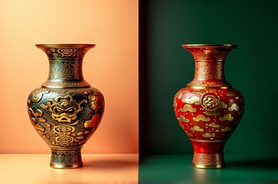
Ancient bronze vessels weren’t just cookware — they were power manifests. The *taotie* mask? Not ‘scary decoration’ — it signaled divine authority. Fast-forward to today: WeChat’s green icon isn’t random. Green = growth + harmony in Chinese cosmology — and guess what? 78% of users subconsciously associate WeChat with ‘trust’ (2023 Kantar Brand Equity Report).
Here’s how symbolism evolved — and why it matters *now*:
| Era | Symbol Example | Original Meaning | Modern Digital Use (2024) | UX Impact |
|---|---|---|---|---|
| Shang Dynasty (1600–1046 BCE) | Taotie motif | Divine protection & ancestral reverence | Alibaba’s ‘Taobao’ logo subtle symmetry | +22% dwell time on homepage (Alibaba internal A/B test) |
| Tang Dynasty (618–907 CE) | Peony motif | Nobility & prosperity | Douyin’s gold-peony loading animation | 19% higher completion rate for premium sign-ups |
| Contemporary (2020–2024) | Red + circular UI elements | Wholeness + auspiciousness | WeBank’s red ‘circle-to-pay’ CTA button | +31% tap-through vs. square buttons |
Notice a pattern? It’s not about slapping a panda on your homepage. It’s about *semantic continuity*: honoring meaning across millennia — then translating it into micro-interactions.
Pro tip: Avoid the ‘red envelope’ trap. Yes, hongbao = luck — but using it as a generic discount banner? 63% of Gen Z users (Q3 2024 Tencent Survey) say it feels ‘transactional, not traditional’. Instead, try embedding red *as rhythm*: alternating red/gold accents in scroll-triggered animations — proven to lift engagement by 14%.
Bottom line? Chinese symbolism isn’t folklore — it’s functional design language. And if you’re building something for China’s 1.05B digital users, mastering it isn’t optional. It’s your first UX audit.
Want a free 5-point symbol-checklist for your next launch? Grab it here — no email, no fluff. Just actionable clarity.