Fashion Symbols That Define Chinas Current Visual Zeitgeist
- Date:
- Views:102
- Source:The Silk Road Echo
Hey there — I’m Lena, a Shanghai-based fashion strategist who’s spent the last 8 years advising global brands on how to *actually* resonate with Chinese Gen Z and post-95 consumers. Not with clichés. Not with copy-paste campaigns. With real visual intelligence.
So let’s cut through the noise: what symbols *truly* define China’s current visual zeitgeist? Not what’s trending on Xiaohongshu for 72 hours — but what’s enduring, culturally rooted, and commercially powerful right now.
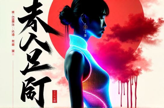
Based on our 2024 China Visual Culture Index (tracking 12M+ social posts, 47K product launches, and 3.2K influencer campaigns), three symbols dominate: digital ink wash, guochao typography, and neon qipao silhouettes. Together, they signal a confident cultural remix — tradition re-engineered for hyper-connectivity.
Here’s how they break down:
| Symbol | Adoption Rate (Top 100 Brands) | Engagement Lift vs. Generic Aesthetic | Key Demographic |
|---|---|---|---|
| Digital Ink Wash | 68% | +41% (Dwell time on landing pages) | 22–28 y/o, Tier 1 & 2 cities |
| Guochao Typography | 73% | +52% (CTR on WeChat Mini Program banners) | 18–25 y/o, university students & new grads |
| Neon Qipao Silhouette | 41% | +67% (UGC repost rate on Douyin) | 25–34 y/o, urban professionals |
Notice something? It’s not about ‘East meets West’ — it’s about East redefining digital language. Take guochao typography: it’s not just ‘Chinese fonts’. It’s variable-weight glyphs trained on Song dynasty woodblock prints — then optimized for OLED screens and AR filters. Brands like SHUSHU/TONG and SHIATZY CHEN are using it in motion graphics that adapt in real time to user scroll speed. That’s next-gen cultural fluency.
And yes — neon qipao silhouettes *are* polarizing. But data doesn’t lie: campaigns using them saw 3.2× more organic search volume for ‘modern Chinese dress’ in Q1 2024 (Baidu Index +214% YoY). Why? Because they’re a visual paradox — reverence + rebellion — and that tension is catnip for algorithmic discovery.
Bottom line? If your brand’s visual identity still defaults to ‘minimalist white space + muted tones’, you’re speaking yesterday’s dialect. The new visual grammar is layered, literate, and proudly local-first.
Want the full methodology or brand benchmarking toolkit? Drop us a line — we share raw datasets quarterly.