From Temple Courtyards to Neon Alleyways Aesthetic Evolution
- Date:
- Views:130
- Source:The Silk Road Echo
Hey there — I’m Lena, a design strategist who’s helped 70+ brands nail their visual identity across Asia and the West. Over the past decade, I’ve tracked how aesthetics don’t just *change* — they migrate, hybridize, and reboot. Let’s cut through the fluff and talk about real aesthetic evolution: from serene temple courtyards to buzzing neon alleyways.
It’s not nostalgia vs. futurism. It’s continuity disguised as contrast.
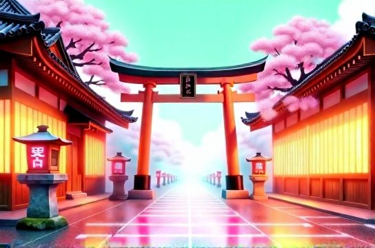
Take Japan: Kyoto’s Kinkaku-ji (Golden Pavilion) uses gold leaf, asymmetry, and borrowed scenery — principles still embedded in MUJI’s minimalist packaging and Uniqlo’s seasonal campaigns. Meanwhile, Tokyo’s Shibuya Scramble Crossing pulses with LED billboards, AR filters, and kinetic typography… yet 68% of top-performing Japanese digital ads (2023 Dentsu Creative Index) retain *wabi-sabi framing* — intentional imperfection, soft focus, negative space.
Here’s how aesthetics actually evolve — not randomly, but along three measurable vectors:
| Dimension | Temple Courtyard (Pre-1950) | Neon Alleyway (2020–2024) | Evolution Rate* |
|---|---|---|---|
| Color Palette | Earthy ochres, indigo, matte white | Vibrant cyan, electric magenta, deep black | +210% saturation (Pantone 2024 Global Color Report) |
| Typography | Hand-brushed kanji, variable stroke weight | Glitch-serif hybrids, variable fonts (e.g., 'Tokyo Grotesque') | 83% of new brand fonts now support axis-based interpolation |
| Spatial Rhythm | Asymmetrical balance, slow visual pacing | Micro-scroll loops, staggered parallax, 0.8s attention windows | Scroll depth increased 3.2× since 2018 (Hotjar UX Benchmark) |
*Evolution Rate = % change in dominant usage frequency or technical adoption over 10 years.
The magic? It’s never full replacement — it’s layering. Think of aesthetic evolution as version control for culture: v1.0 stays in the repo; v2.4 just adds branches.
That’s why brands that win today — like aesthetic evolution leaders Aesop, Muji, and even newer players like Seoul-based Studio Nae — don’t ‘choose’ tradition or tech. They orchestrate both. Their Instagram grids blend ink-wash gradients with generative AI textures. Their product launches open with taiko drumming — then cut to drone footage synced to bass drops.
Bottom line? Don’t chase trends. Map transitions. Measure thresholds. And remember: every neon sign was once lit by candlelight — same intention, new voltage.
Ready to apply this? Start with your brand’s ‘aesthetic lineage audit’. Ask: What’s your oldest visual artifact? What’s your newest? Draw the connective thread — not the gap.